
Case Study: Improving the eCommerce purchase journey.
Role: Lead UX designer, UX researcher, & user test moderator (2023).
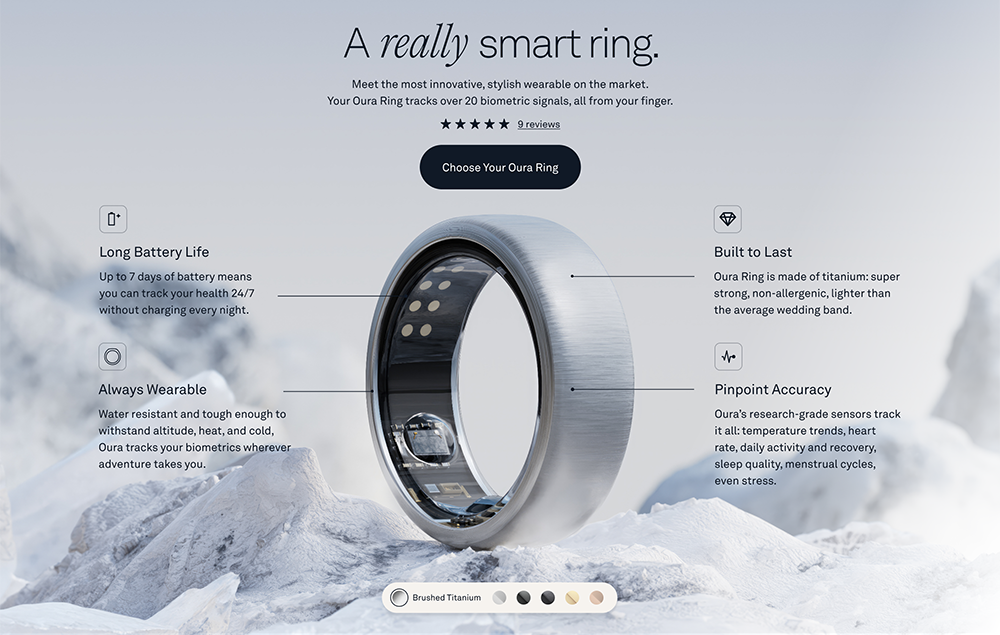
Problem
- High drop-off rate. Over 65% of users who initiate the purchase journey fail to complete it.
- Low scroll depth: Only 25% of users scrolled to the bottom, missing crucial information that could influence their purchase decision.
- Confusing UI: This led to the Call-to-Action (CTA) being ignored and users rage-clicking.
- Overwhelming Cart and Checkout flow: Excessive information caused choice overload and cart abandonment.
- Limited payment options.
Method
- User Testing: Conducted sessions to identify pain points and understand user behavior.
- A/B Testing: Implemented different design variations to determine the most effective solutions.
- Usability Testing: Assessed the ease of use and clarity of the UI to improve user experience.
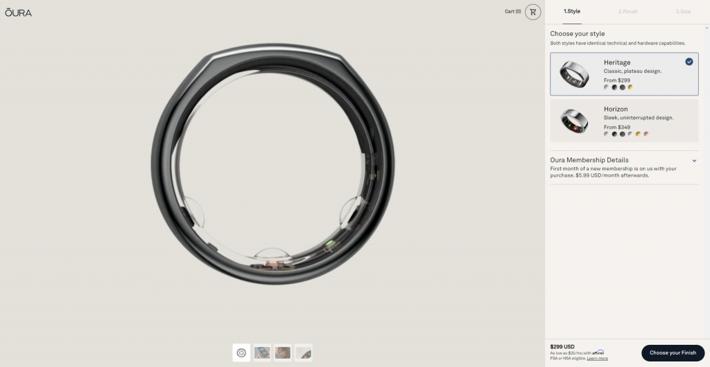
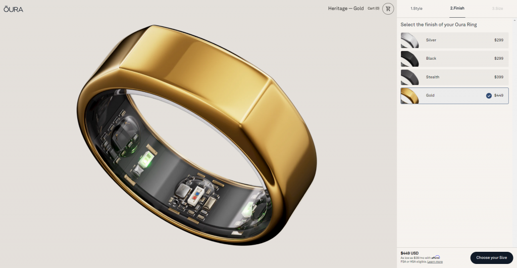
Solutions
- Replaced One-Page Product Detail Page with a Purchase Wizard: Simplified the purchasing journey by guiding users through clear, step-by-step instructions, minimizing complexity and enhancing user interaction.
- Added Visual Cues on Primary Pages: Implemented indicators to let users know there was more content below, encouraging deeper scrolling.
- Simplified Layout and Enhanced Interactive Elements: Made the layout cleaner and more intuitive, and ensured clickable elements were more apparent to users.
- Introduced New Payment Options: Expanded the available payment methods to cater to a wider range of user preferences.
Results
- Conversion Rate: Exceeded Oura Ring’s goal of a 10% lift in conversion, attaining an impressive 19% increase.
- Enhanced Payment Experience: Through strategic design and A/B testing, improved the payment process, boosting the share of US sales from 7% to 12.5%.
- Improved Scroll Depth: Achieved a 35% increase in scroll depth, ensuring more users reached the crucial information at the bottom of the page.