Case Study: Conversion rate optimization for Ecommerce product landing page.
Role: Lead UX designer (2025).
Overview
Whisker’s objective was to increase conversion rates across their website, particularly for their flagship product, the Litter-Robot 4. The challenge was to craft a landing page that streamlined the user experience, free from the clutter of existing structures and brand designs. The goal was to focus the user journey on the Litter-Robot 4—informing, educating, and guiding users towards purchase with clarity and ease. Through A/B testing, we sought to validate whether this approach would yield better conversion rates than Whisker’s existing homepage.
Our hypothesis: A product-focused, simplified design would result in a higher conversion rate for users interested in the Litter-Robot 4.
Problem
Whisker’s homepage was overloaded with too many product options and calls to action (CTAs), creating confusion and diluting the focus on the Litter-Robot 4. The scattered navigation and numerous distractions meant that potential customers were less likely to engage deeply with the Litter-Robot 4, reducing the likelihood of conversion.
- Unfocused messaging: While the Litter-Robot 4 was the primary product, additional products and bundles diluted the messaging.
- Cluttered navigation: Too many choices in the primary navigation caused confusion, preventing users from following a clear path to conversion.
- Overwhelming CTAs: Multiple options (e.g., product detail pages, builder tools, category pages) meant users didn’t have a clear, guided journey.
Objective
Business Objective
Design a user-centric website experience focused on showcasing the Litter-Robot 4, introducing it effectively to potential customers, educating them, and guiding them toward a purchase decision. The goal was to boost global marketing potential for this flagship product.
Marketing Objective
Enhance the user experience to reduce bounce rates and increase conversions by creating a simplified, seamless journey toward purchasing the Litter-Robot 4.
Approach
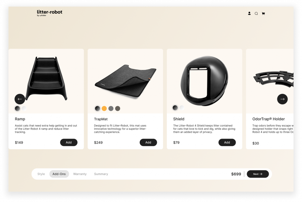
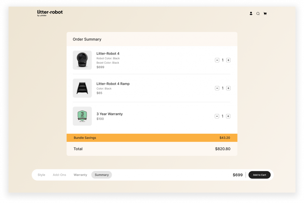
User-Centric Homepage: Developed a homepage that prominently featured the Litter-Robot 4, with clear paths guiding users towards learning more about the product and making a purchase decision.
Simplified Navigation: Redesigned the navigation structure to reduce clutter and offer clear, concise pathways focused on the Litter-Robot 4.
A/B Testing: Conducted a comparative analysis between the new landing page and the existing homepage to measure the impact of a simplified, product-focused flow.
Solution
- Move Value Proposition Higher: Placed the key value proposition for the Litter-Robot 4 prominently above the fold, ensuring users quickly understood its unique benefits.
- Modern UI Elements: Incorporated sleek, modern UI components to improve usability, brand perception, and overall design effectiveness.
- Improved Accessibility: Ensured high-contrast ratios for better readability and conducted an accessibility audit to align with Web Content Accessibility Guidelines (WCAG).
- Targeted Content for Cat Owners: Highlighted content specifically meaningful to cat owners, helping to reduce cognitive load by focusing on relevant information.
- Mixed Visuals: Integrated both product and lifestyle images to enhance the visual storytelling of the Litter-Robot 4.
- Founder Story Video: Added a video featuring Whisker’s founder, which fostered a personal connection and increased brand authenticity.
- Strategic Use of Whitespace: Used whitespace to guide attention to key elements, ensuring clarity and simplicity throughout the user journey.
Results
The new landing page design achieved a significant improvement in conversion rates and first-time purchasers. The hero section and strategic CTA placement in the new design were pivotal in driving these results. This case study demonstrates how a simplified, user-focused approach to product pages can have a measurable impact on business performance. By leveraging user insights, modern design practices, and clear calls to action, Whisker saw measurable improvements in both conversion rate and average order value for the Litter-Robot 4.
- Control Version Conversion Rate: 1.99%
- Variant Version (New Design) Conversion Rate: 2.38%
- First-Time Purchasers: Increased by 31.9%.
- Average Order Value (AOV): Increased by 4.90%.


